
"Mardi Gras! 113th Celebration": I was honored to have been tasked with creating 2024 Mardi Gras! Galveston poster. Upon submitting it into Yaga's official poster contest, I won first place! This photo was featured in an article for College of the Mainland. (Click on me!)

The poster itself. I had envisioned a scene that people could latch onto upon viewing, allowing them to build a narrative and seek out details that enrich the story. This was also the subject of an interview with I45 Houston. (Click on me!)
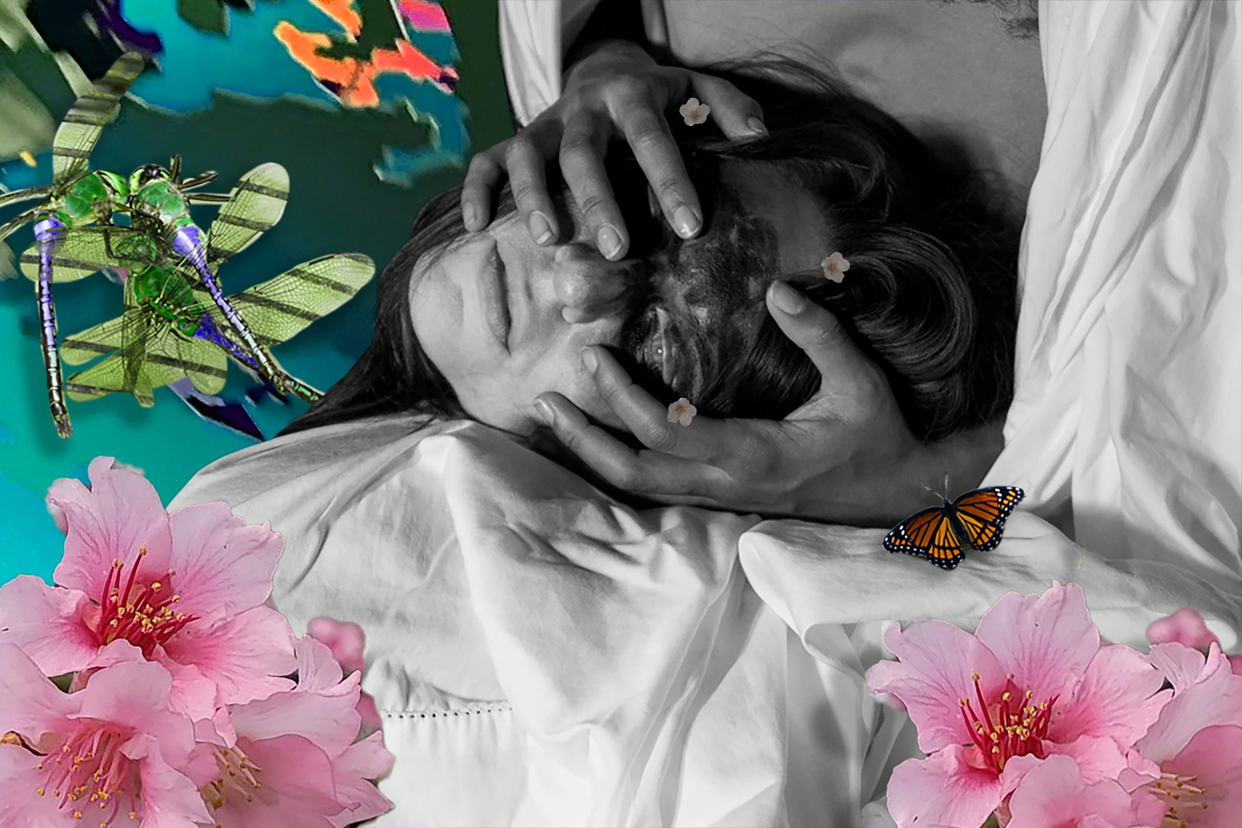
A creative response to our reading, “The Invention of Hugo Cabret.” Drawn to the face of the automaton Hugo so lovingly humanizes. I thought I’d perhaps try to embody it with crackled porcelain skin, ruddy roses for cheeks, and a touch of pale blue translucence. Returning to this book after many years, it reminded me of day time dreaming, and the stirring love for woeful faces amidst silence. So much is said.
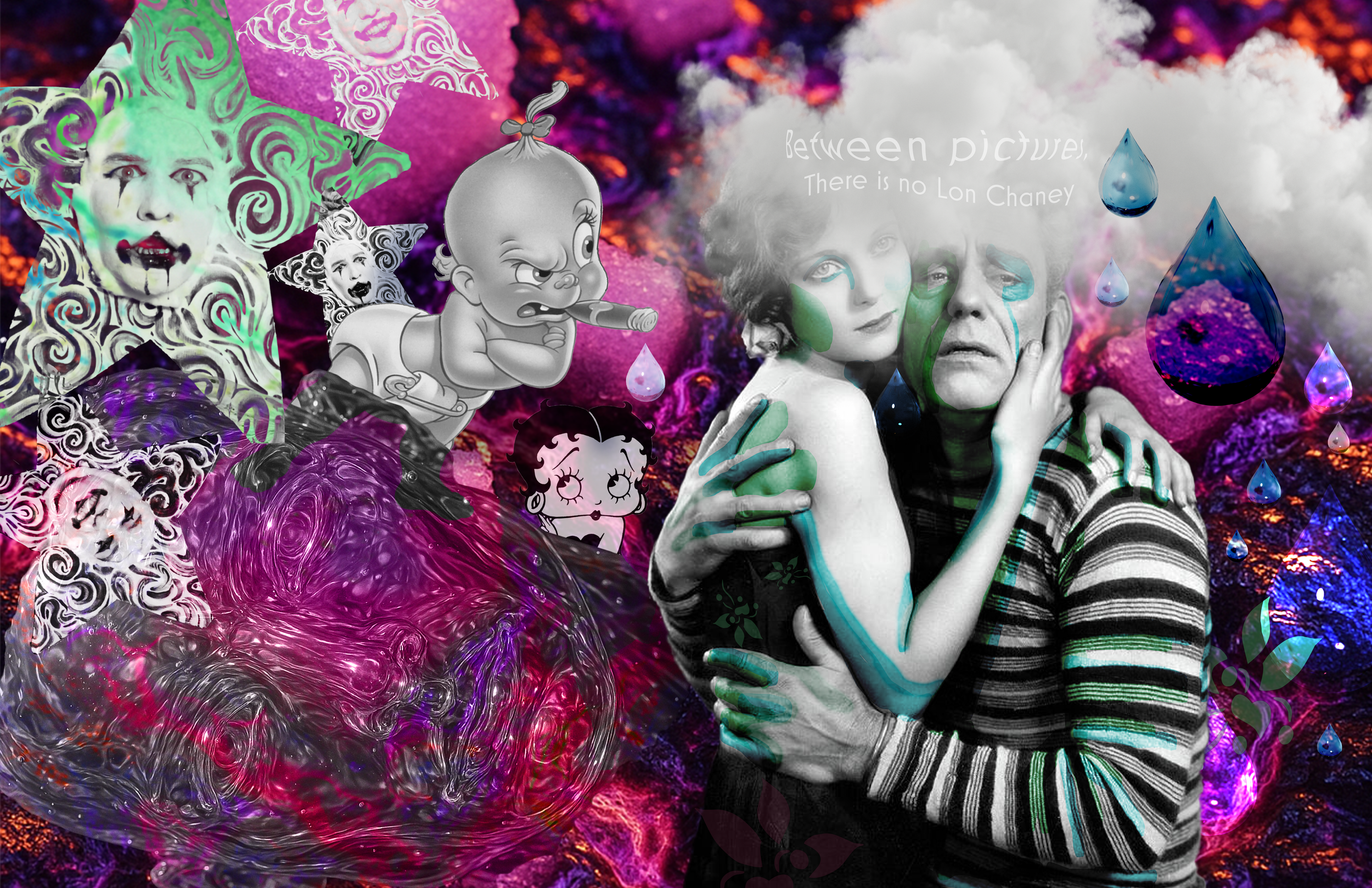
Some familiar faces resurfacing. Tasked with creating a personal/professional mood board, I had forgone an ageless maturity in favor for the flavor of old acidic sugar. I guess the subconscious wanted to make light of the lava pit, melting into a shapeless, unending, creator who’s looking to have a good time.
"Prophet's Throne" To know, is contentment, to know better, is challenging. To whom might take offense upon speaking of what the world is and of what you could be? These questionable words turn to one’s own condemnation; from that state, hastily drawing sword to attack the enlightened. Perhaps it be not from your own hand but with the conspiracy of another. So it goes the prophet’s head, will it be honored with polished silver, or left for the grubs and millipedes to turn in fleshy catacombs? I look to the prophet and furrow a brow at dying to anything, perhaps my family, yes any soul would, but for the metaphysical? What did you know? Entering with measly words that stirred, and leaving in silence, having seen the end from the beginning. I listen and wonder what it would take to have a prophet’s resolve. Show me. Medium: Photography & Adobe Photoshop
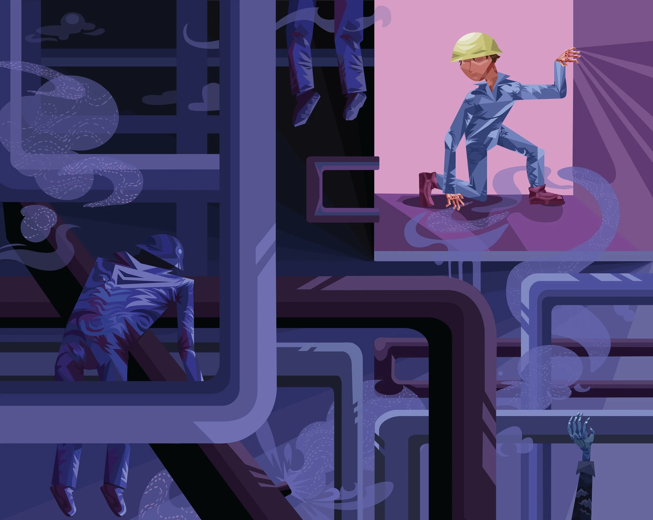
My father having worked at Valero refineries, would tell stories of friends and coworkers suffering sudden and fatal incidents. When chemical spills, gas leaks, or explosions took place, he’d be asked to name and identify those that he knew. Mediums: Adobe Illustrator

"Moonlight Chase.” I’m reminded of the presence of German Shepards roaming the property at night in delight seeking trouble, in a pack of doubles and the rabbits that wished to nourish themselves under the gentle star-lit illuminance. Together they run in circles, continuing their waltz for as long as the moon allows it. I too am on a mission, longing for more. As a dog, I chase after a future that at times alludes me. As a rabbit, I must swiftly evade the wetted fangs of comfort. All the while, I dream of the home, at the center, it pulls me in with its gravity, providing a sanctuary of reprieve. To my parents, this mobile belongs, they who’ve allowed me the space to chase. Mediums: Laser cut wood & Spray paint
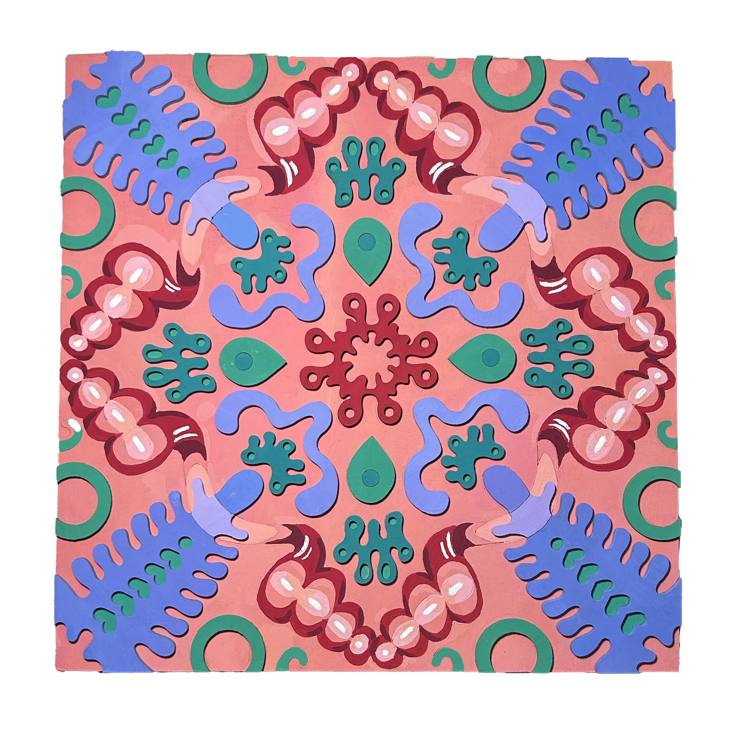
"Samba," a variation of Pool Party. A wood panel art piece made from an original design, painted, and assembled, to create what will become my favorite piece of home decor.

Color Theory: Mandala Project "Pool Party" After so many revisions of an organic shape, it’s hardly recognizable from its source material. Though distinctly, I remember there being one curly fry seashell whose spirals looped me down a water slide. Unintentionally, the color palette matched this quiet thought, by hosting a pool party without my permission. There are blow up tubes, foam noodles, and unsupervised play here. Mediums: Acrylic Gouache & Photoshop

Tee shirt design for a Georgia non-profit: I chose Sweet Olive Farms due to the obvious heart the owners have for their animals. The design directly credits the farm, allowing the back to speak to the wide open space that even the mighty mustang, “Pastis,” can roam freely in. I chose this color palette as to disrupt the anticipated earth tones, and provide a color shock that mirrors the energy of the caretakers, Kat & Susan. I enjoyed employing a minimal design and frankly, just drawing a horse, there’s so few occasions to do so. Mediums: Illustrator & Photoshop
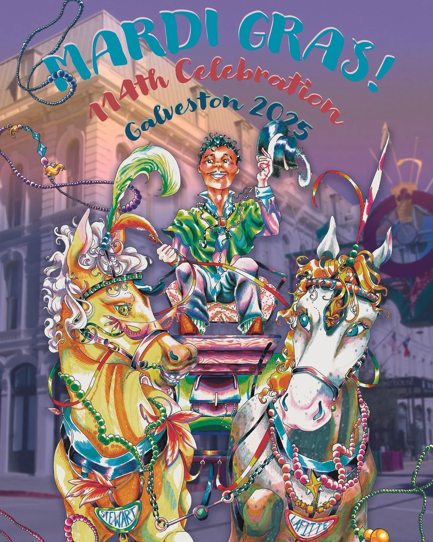
"Mardi Gras 2025" While I didn't win the following year, it's not without having illustrated a fine coachman inspired by Cab Calloway and horses with a sense of life! Mediums: Photography, Pen, Prisma, Markers, & Photoshop

In-N-Out made a call for summer picnic t-shirts to be designed and submitted by their employees, I couldn't pass up that opportunity. Of all design concepts they have for their brand, I hadn't seen anything that elevated their off-the-menu items. Thus, "Go wild, Animal style," was born.
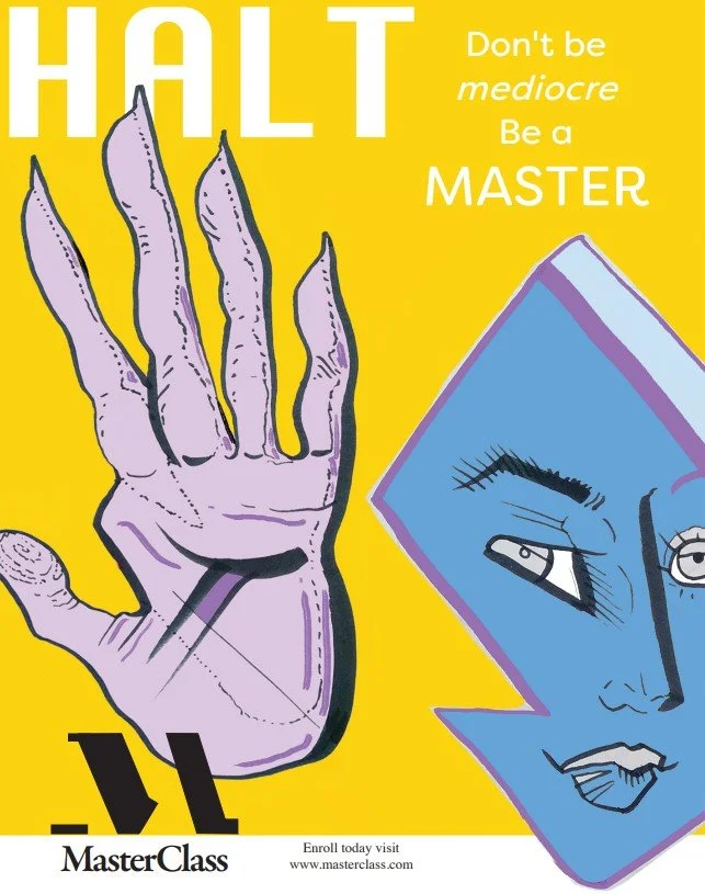
In tandem with Boonies, it felt appropriate to fabricate ads that would target artistic readers. Masterclass would be no outlier to this. The drawings were done in marker and digitally colored.

Color Theory: Bezold Project “Taken in Stride,” is the name of my lovely lady. There’s something cool and liquid about her that embodies how I wish to enter and leave any given scene. She’ll be used as gift wrapping paper, appropriate for long time, no see, kind of presents, or any occasion that isn’t explicitly holiday related. I chose her color scheme of purples as there’s a grounded mystic that conveys a level of femininity without an aloof or sexy approach. Her design is meant to ride the line of playful but mature. Mediums: Illustator

“Teef” In creating a piece for a texture project, I considered the state of our very own teeth. Being filled, coated, and covered in most anything. And how in my own dreams I’d have a bottom grill of the finest silver…one of these days. Mediums: Photography & Adobe Photoshop

The magazine cover of my, "Boonies," concept. The unearthing of artists in small towns in all forms of self expression.

Seasonal Hobby Lobby Ad that isn't just a page of coupons. (Though that is greatly appreciated)

My original poem, "Blue Bird," brought to life through pen and marker, refined through Adobe Illustrator. I wanted the piece to reflect the first line, "Blue bleeding from behind the blinds." Something cozy about it, in its solace.

Original font named, "Sulfur." I was inspired by the graffiti branded on train carts headed towards the chemical refinery. While I personally find them eye sores, there's credit due in its distinct features... An hour would pass under the red blinking traffic light. It's night and I want to be home as work will demand many more hours in tomorrow's day. Sitting there, music turned to the volume of bloody drums, playing to the fuzzy, graffiti, amateur hour of some gang's brand. All passing, hardly moving.

Yet another imaginative business, this time of a pest control service named, "Road Rat." Drawing made through traditional pen/marker mediums, refined through Photoshop and scripted through InDesign. In designing a rack card, the pun created itself...a, "rat" card. Ha!

Road Rat magazine spread, page one. Compliments to The Spruce: "9 Signs of a Mouse or Rat Infestation in Your Home," for the article I could adjust and tailor accordingly.

Road Rat magazine spread page two. Though it may not be evident on the layout of this website, side by side, these pages make a cheese wedge. A little extra detail. Usage of Photoshop and InDesign.

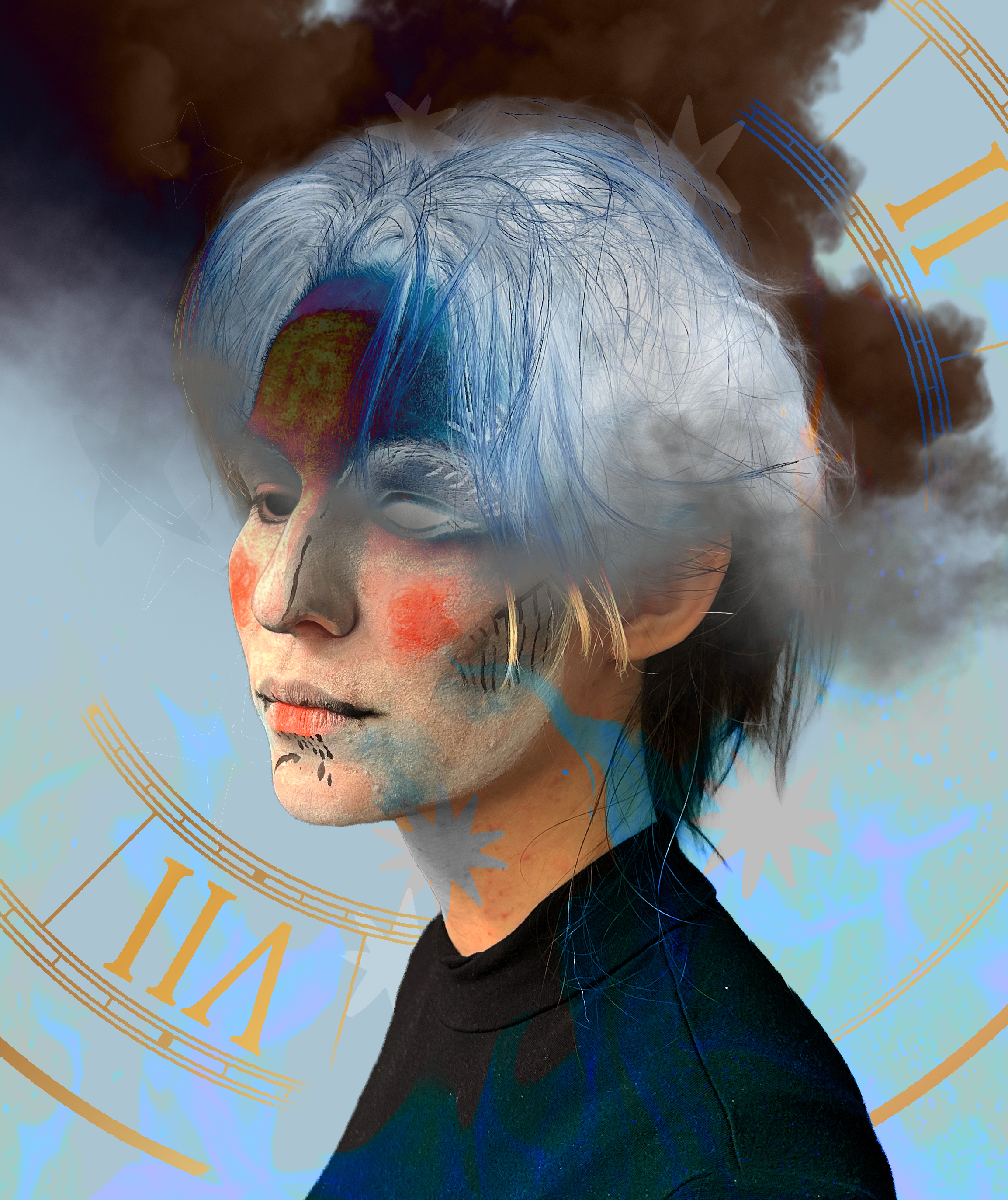
Self portrait created through Adobe Illustrator. An exercise in using the pen tool for all those painstaking details! Not too shabby...though I might've flattered myself with brighter eyes and vibrant face paint, ah well.
In my time at SCAD & College of the Mainland, I’ve been able to take my fine art skills and apply them to the digital world. Evolving and blossoming, I’m proud to present myself with an adobe skill set that only compliments my life style of creativity.